阿豪运维笔记
逛别人博客的时候发现Logo有扫光特效觉得挺神奇的,抱着学习的态度咨询了下对方得到的答复是使用了CSS样式来实现Logo扫光特效。简单写个教程记录下如何使用纯CSS样式代码实现Logo扫光特效,同时也给需要同学提供一丢丢帮助。
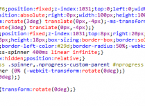
把如下CSS代码加在网站的样式表中例如style.css文件中
以下是CSS代码片段
PS:.logo为代码中调用的样式代码名称
/*扫光样式代码开始*/
.logo {position:relative;float:left;margin-right:10px;padding:5px 0;overflow: hidden;}
.logo a:before{
content:"";
position: absolute;
left: -665px;
top: -460px;
width: 200px;
height: 15px;
background-color: rgba(255,255,255,.5);
-webkit-transform: rotate(-45deg);
-moz-transform: rotate(-45deg);
-ms-transform: rotate(-45deg);
-o-transform: rotate(-45deg);
transform: rotate(-45deg);/*角度倾斜45*/
-webkit-animation: searchLights 1s ease-in 1s infinite;
-o-animation: searchLights 1s ease-in 1s infinite;
animation: searchLights 5s ease-in 5s infinite;/*光扫过去的时间,自己修改,可以加快*/}
@-webkit-keyframes searchLights {
0% { left: -100px; top: 0; }
to { left: 120px; top: 100px; }
}
@-o-keyframes searchLights {
0% { left: -100px; top: 0; }
to { left: 120px; top: 100px; }
}
@-moz-keyframes searchLights {
0% { left: -100px; top: 0; }
to { left: 120px; top: 100px; }
}
@keyframes searchLights {
0% { left: -100px; top: 0; }
to { left: 120px; top: 100px; }
}
/*扫光样式代码结束*/